You are here: Home / Extras / Settings / Administration / Listen

Settings
Listen
In onOffice enterprise, lists are used in many places. The list views of the modules and some other lists are configurable. You can centrally specify which columns are displayed, what order they are in, and specify the column width. A part of the lists can be additionally customized by the user. In these cases, the list configuration icon ![]() is displayed at the top right of the list.
is displayed at the top right of the list.
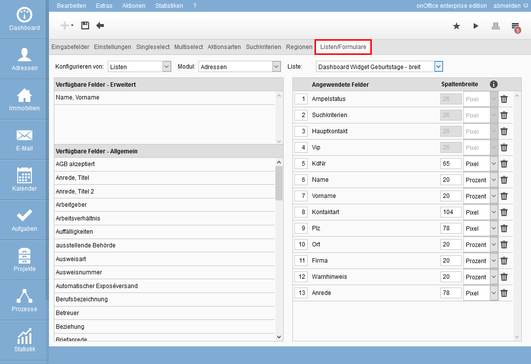
Besides the lists, there are also configurable forms and bar contents. All of them together are configured centrally in the Administration, via Tools >> Settings >> Administration >> Lists tab.
Using the selection boxes at the top, you can choose between lists / forms / info bar. After selecting the module, you will see all the associated configurable lists under “Lists”.
Via the selection boxes “Configure from:” and “Module:” you get the list of configurable lists. The name of the list corresponds to the place where it appears, this can be the tab in which the list appears or the name of a widget or the function etc..
The main list is the list that is displayed when the module is opened. Assignment lists are displayed e.g. in the address assignment popup for e-mails, minilists are displayed e.g. in the appointment popup or activity popup.
To edit an info bar for e.g. addresses, select the value Info bar via the selector ‘Configure from’. The info bar can be set for properties and addresses.
It is also possible to individualize the forms (assignment forms) from them. This allows you to specify which fields are displayed when creating a new address via the assignment form.
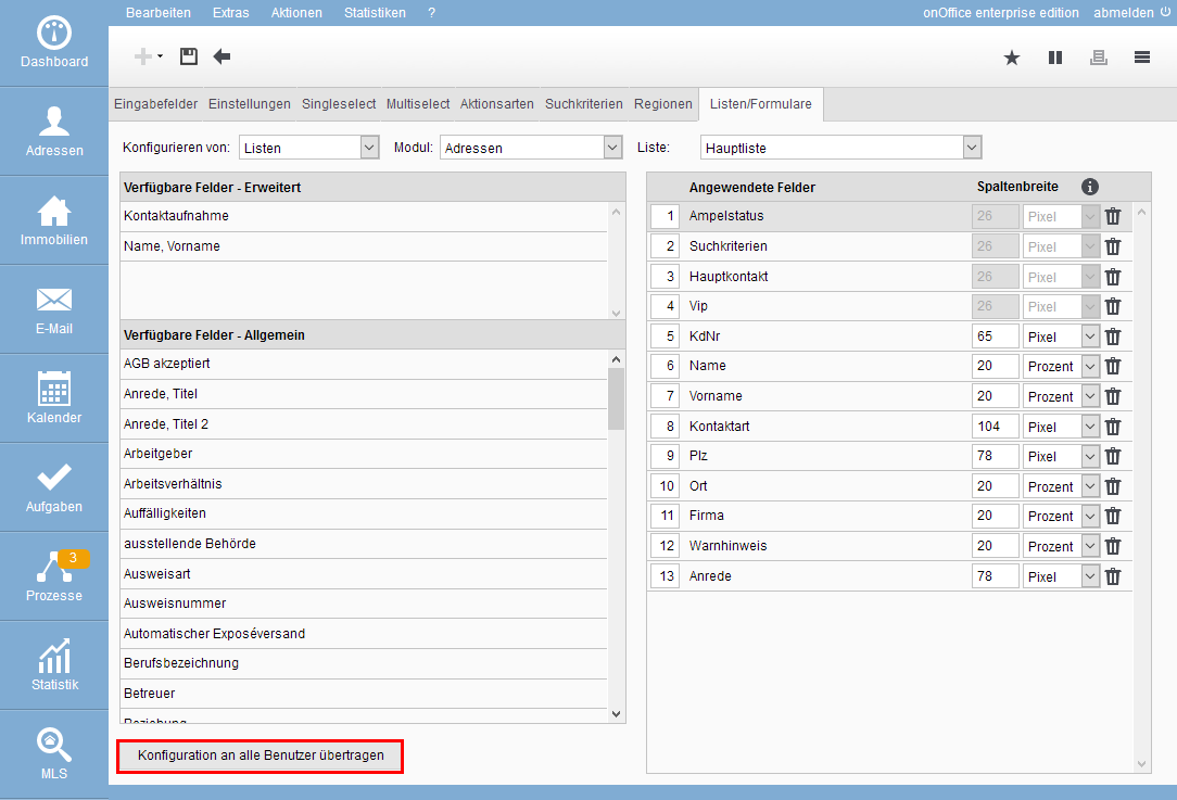
The configuration shows on the left half the available fields – the fields activated in the administration, also individually created ones. Some fields or field types are excluded from this. Special fields, such as the combination field ZIP & City, are listed under “Advanced”.
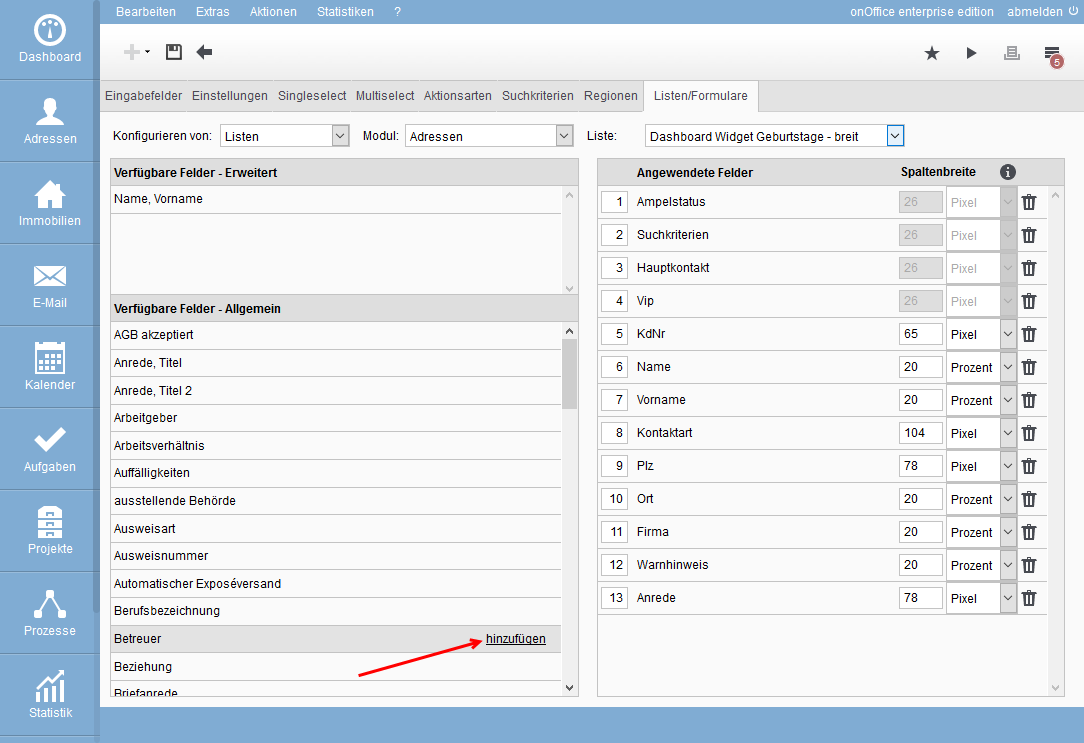
When you move the mouse over an available field, “add” appears in the line. Click to move the field to the list of displayed fields and add it at the bottom. Clicking the trash can icon moves the field back to the list of available ones.
You can also use combined fields that are not found as a field in the record. Thus, under “Available fields – Advanced” you will find the combined field “Name, First name”, while in the address record “Name” and “First name” are only available individually.
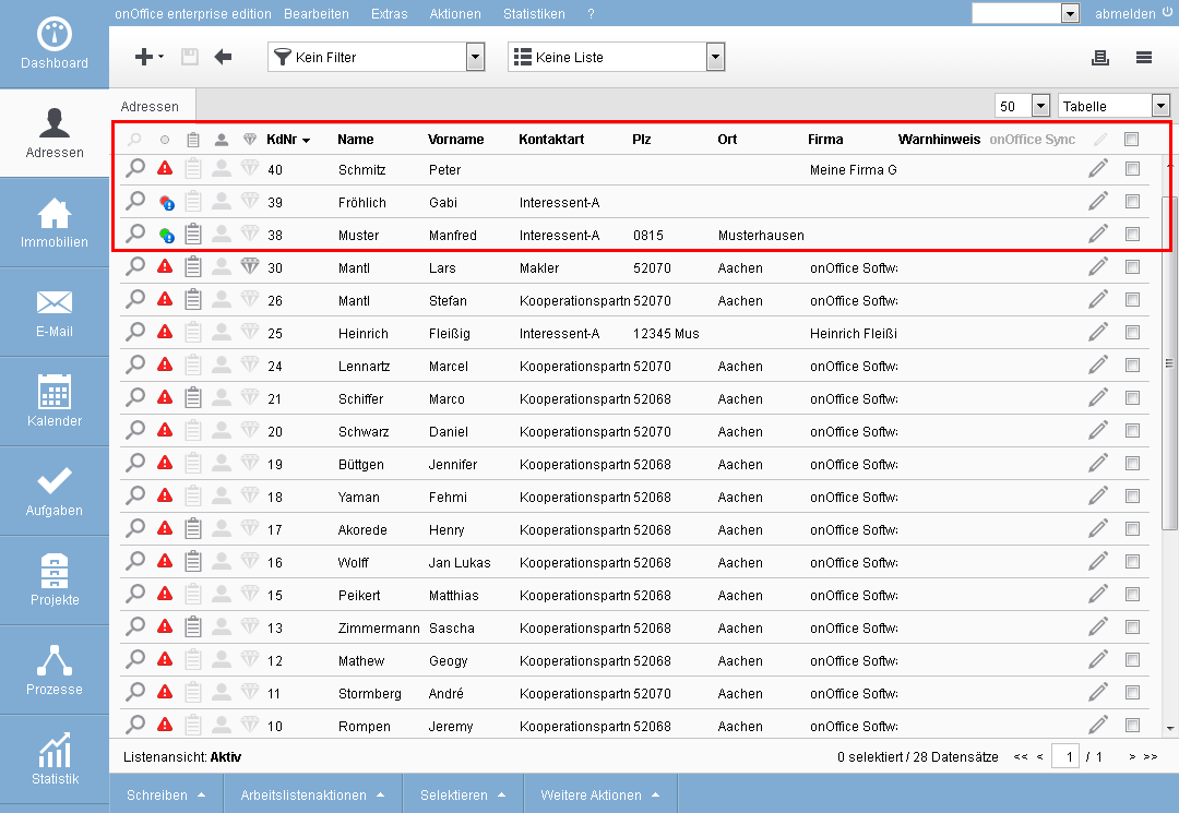
After saving the new configuration, the column is available in the list view.
If the column caption in the list is grayed out, it means that you cannot sort the list by that column.
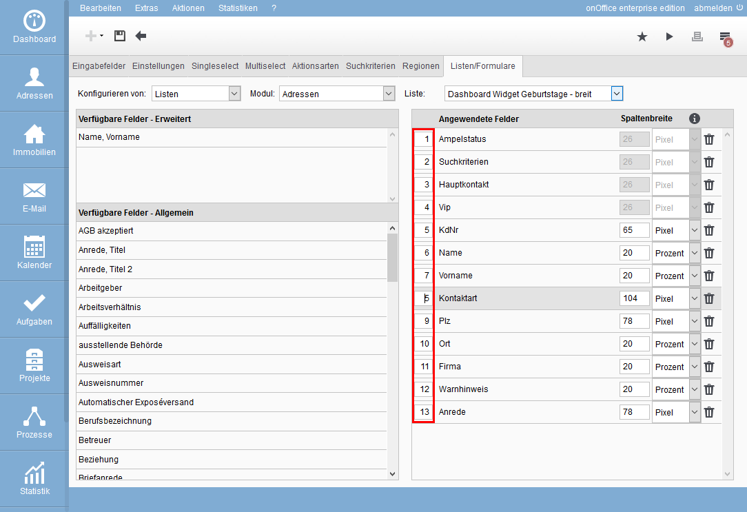
You can adjust the order in the list according to your wishes. If you change the number in front of the fields in the list settings, the field jumps to the position you want.
Please complete the change with “Save”.
For lists, in addition to the columns and their order, you can also customize the width of the columns. The column width can be specified as a fixed number of pixels or as a percentage of the “available space”. The percentage columns are displayed in a different width accordingly when the window size is changed. Depending on the configuration and window size, the column can then “almost” disappear. Therefore, please always check the changes in different browsers and at different window sizes.
Fixed columns have a minimum width of 20 pixels, smaller values cannot be saved.
How is the “available space” determined? This sounds like a simple question, but since the browser calculates the width of the percentage columns on its own, the explanation is a bit “longish”.
The detailed description follows, here is the short version: “After all fixed columns are displayed, the remaining space is distributed proportionally among the percentage columns”. If necessary, the browser automatically displays a “scrollbar”.
For the detailed description, we need some terms that are also found in the images for the 2 sample cases below.
- List width; The list width is the sum of the fixed column widths, the fixed columns (magnifying glass, pencil icon and checkbox – 86 pixels in total) and the one with percentage width. For each column with percentages, 65 pixels are added.
- Visible width; content area in onOffice enterprise, between the module bar and the right window border.
- available space; space requirement of all percentage columns together. “Space” instead of “Width”, since only the minimum width of all percentage columns together can be specified. However, the available space may be larger than the minimum width. The available space does not have to be in one piece, it can be spread out over the list in any way. However, for calculation purposes, it can always be considered as “a whole piece”.
In principle, the “available space” is always calculated according to the following formula: List width minus sum of all fixed column widths.
However, depending on whether the list width is larger or smaller than the visible width, the browser displays the percentage columns differently:
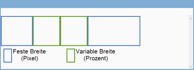
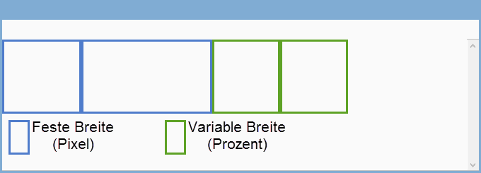
Case1; The list width is smaller than the visible width: “Visible width” minus “All fixed widths” gives the “Available space”, example:
For a better overview, the fixed and the percentage columns are moved next to each other.
The browser widens the percentage columns so that the complete available space is occupied by the 2 columns. The width is calculated in the ratio of the specifications, in the example both were the same width at the beginning and are then also displayed the same width.
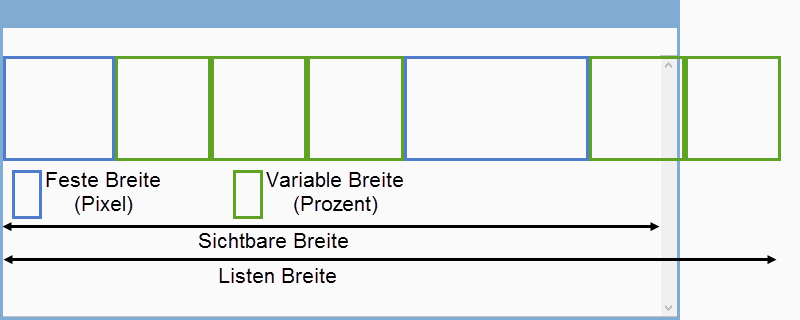
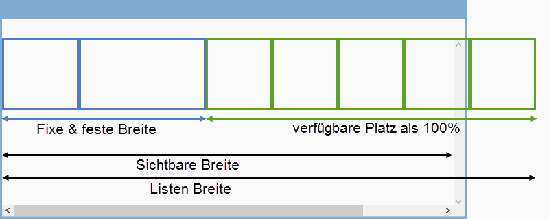
Case2; The list width is larger than the visible width: “List width” minus “All fixed widths” gives the “available space”. For technical reasons, a width for the percent columns is necessary. The width is set at 65 pixels. In this case, the “available space” is always the summation of the percentage columns with 65 pixels.
Example:
For a better overview, the fixed and percentage columns are placed next to each other. As soon as the “Visible width” becomes smaller than the list width, the browser automatically displays a scrollbar. The width is calculated in the ratio of the specifications, in the example all were the same width at the beginning and are then also displayed the same width.
The width of the percent columns is determined according to the ratios to each other from the widths you entered. In other words, you don’t have to think about how many percent of width you have already distributed or make sure that the sum is exactly 100. They only indicate the relationship to each other.
Example: Column 1 gets a number of 60 as width. The 2nd column with percent is to be twice as large as the first, thus gets 120 as a number for the width. The 3rd column is to be slightly wider than the second and is then given a width of 160.
The sum of the widths is 340. This figure is taken as 100% and the columns are then distributed according to their share. Thus, column 1 gets 60/340 = 0.176 i.e. 17.6% of the available space. Columns 2 and 3 are then (120/340) = 35.2% and (160/340) = 47.2% of the “available space”.
One point remains, what happens if only fixed column widths are used and the list width is smaller than the “visible width”? In this case, the last column on the right becomes a percentage column and fills the remaining space.
For some lists, users can individually configure the columns and column width. This configuration can be reset here for all users.
Only the default list tabs are reset – tabs that the user has created himself remain unchanged.
Widgets with lists cannot be overwritten centrally.
For all lists where the configuration can be reset, the “Transfer configuration to all users” button appears at the bottom left.

 Entry
Entry Dashboard
 Contacts
 Properties
 Email
Email Calendar
 Tasks
Tasks Acquisition Cockpit
 Audit-proof mail archiving
 Automatic brochure dispatch
 Billing
 Groups
 Intranet
 Marketing Box
 Multi Property module
 Multilingual Module
 onOffice sync
 Presentation PDFs
 Process manager
 Project Management
 Property value analyses
 Enquiry Manager
 Showcase TV
 Smart site 2.0
 Statistic Tab
 Statistics toolbox
 Success Cockpit
 Time Tracking
 Address from clipboard
 Text block
 Customer communication
 External Tools
 Favorite links
 Calculating with formulas
 Mass update
 onOffice-MLS
 Portals
 Property import
 Quick Access
 Settings
 Templates
 Step by step