 Entry
Entry Dashboard
 Addresses
 Properties
 Email
Email Calender
 Tasks
Tasks Acquisition Cockpit
 Audit-proof mail archiving
 Automatic brochure distribution
 Billing
 Groups
 Intranet
 Marketing box
 Marketplace
 Multi Property module
 Multilingual Module
 onOffice sync
 Presentation PDFs
 Process manager
 Project management
 Property tracking
 Property value analyses
 Request manager
 Showcase TV
 Smart site 2.0
 Statistic Tab
 Statistics toolbox
 Success cockpit
 Time recording
 Address from clipboard
 Boilerplates
 Customer communication
 External Tools
 Favorite links
 Formulas and calculating
 Mass update
 onOffice-MLS
 Portals
 Property import
 Quick Access
 Settings
 Templates
 Step by step
You are here: Home / Additional modules / Smart site 2.0 / Content / Structure

Smart site 2.0
Content / Structure
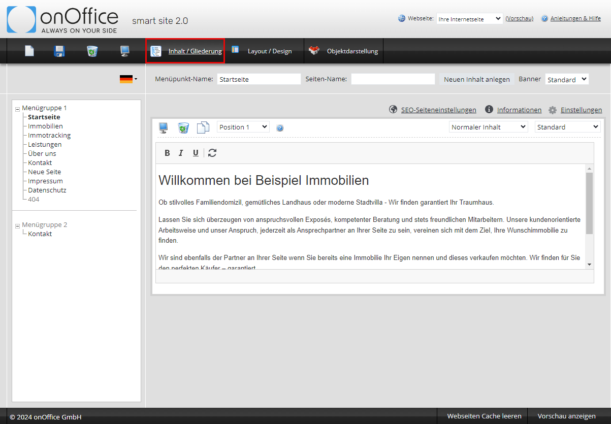
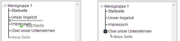
Working with Menu Groups
The menu groups 1 to 3 are displayed here.
Menu group 1 is the main menu group and is always displayed vertically on your website. Menu group 2 is displayed horizontally, except in templates 1 and 5. Menu group 3 is only available in templates 3 and 2.
Create and edit pages
You can create a new menu item using the icon  . The new menu item is created ‘offline’, if it has been filled with content, you can switch the menu item ‘online’ using the monitor
  symbol in the menu bar. The menu item and the content can be switched online/offline separately. Only if the menu item + content are ‘online’, the content can be seen. Placing a content online alone is not enough.
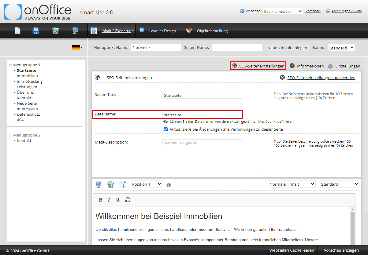
You can change the name of the newly created menu item in the configuration box in the ‘Menu Item Name’ field.
NOTE: Please also adapt the URL name.
For text content, you can start writing immediately after creating the content element. For other content, you should define the content types and content layout beforehand. This can also be changed afterwards, it has proven to be easier if this is determined in advance.
Switch content online/offline
You can switch the individual contents online  and offline using the monitor symbol in the header. Please remember that the menu item must also be online for you to see the content. If you switch a content online and the menu item is still offline, onOffice smart site asks whether the menu item should also be switched online.
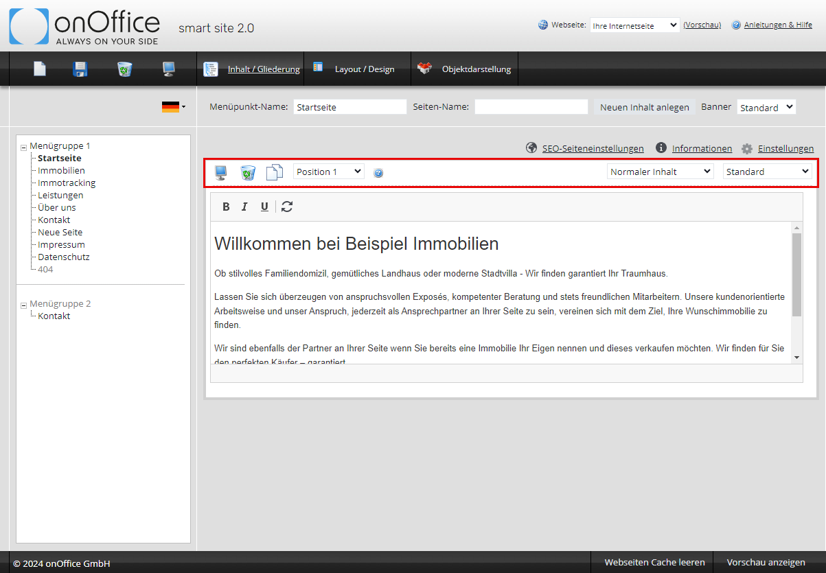
Add, copy or delete content
With the button ‘Create new content’ in the configuration box you can create new content.
The new field is added below.
The new content element is always created ‘offline’, it has to be switched online manually after it has been filled with content.
Several content elements with different content types per menu item are possible.
You can also copy a content element by clicking on the “Copy”  button in the configuration bar of each content element.
The contents can be deleted using the trashcan symbol in the header line.
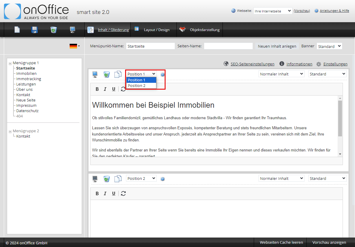
Content – Position
You can adjust the position using the ‘drop down list’ in the header
Content types
The list of selectable types differs depending on the apps added. For most types, further settings/selections can be made via the contents layout list.
- Normal content: The ‘Normal Content’ is the default type when creating a new content element and can be used for almost everything. With the layout ‘Standard’ you can enter text, images, lists, links etc. Via the toolbar in the input field you can format the text etc. as you already know it from onOffice enterprise edition, e.g. when writing an email. The detailed explanation of the editor can be found here. In addition to the layout ‘Standard’ there is the layout ‘Template Team’ for the team list with photos of the individual employees. Please replace the placeholders with the data of your employees.
- Imprint: Here the master data from the basic settings of onOffice enterprise edition are displayed, that is the contact data. You still need to add mandatory information such as your terms and conditions to ensure a complete imprint. You have to create these texts yourself, for example by using a new content box.
- Sitemap: The sitemap displays a structured view of the website with all subpages.
- Forms: You can use the forms for contact requests, owners with a property for marketing or to enter interested parties.
- Presentation of offers: This content type allows you to create elements for the various property representations of your properties. For example, you can present your top properties in a separate area or showcase your reference properties. Of course, you can also present all your properties in a clear and informative way. You control which properties are published in which area in onOffice enterprise edition. The layout of the property display is defined in the property display area.
- News: The news app automatically presents the news articles that you create in onOffice in the selected menu item on your website. You can also specify a category, which allows you to customize your website. You can also set the number of posts that will be displayed. As soon as you upload a new entry, the bottom one slides to the next page, which you can find via the navigation bar below the news.
You can create news content in your onOffice enterprise Edition (), you do not need to log in to smart site 2.0. - iService: I-Service allows owners to launch a query to find out if you have potential prospects among your customers. The app is configuredin the app management. Which address records can be found is determinedby the contact type.
- Property tracking: This creates the login for the property tracking. You can find more information about property tracking here.
- HTML source code: If none of the predefined content types fits, you can use this to insert HTML source code, e.g. to embed an external video on your website.
Fill content elements
You can combine any content elements one after the other on one page. Insert headings and text as desired. You can set simple formatting in the editor menu bar. Further formatting options are available in the CK Editor. To open it, click on the blue editor  button .
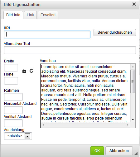
In the CK editor you can insert images and links to other pages etc. in addition to text.
 |
Inserts a picture. |
Specify in the image properties which image is inserted and how it is formatted.